My goal with this work is to draw attention to how far we've come over the years by acknowledging both the past and the present in the same composition
Tuesday, April 30, 2013
Friday, April 19, 2013
Sunday, March 31, 2013
Portrait Collage
I really like the way make my images turn out and I thought the would look great in a collage, so I decided to make one. I think it's pretty cute.. and funny!
Assignment 3: Portraits
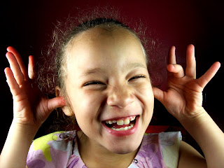
Camryn, 1
"Nanny"
This was by far my favorite assignment. I had entirely too much fun working on it, can't you tell?
I decided to use the Jill Greenberg-esque approach to 3 point lighting and I think it turned out pretty well.
My theme was "driving Grandma crazy". My subjects were my mom, and my sister's four children.
Tuesday, March 19, 2013
3 Point Lighting Editing
These photos were kinda easy and kinda tricky to edit because I really like strong contrast, but the shadows in the face would get a little too overwhelming.
I also made sure to turn the red up so that way I could add a little "blood flow" in myself, Elizabeth, and Asa, otherwise we would have been really flushed out.
Asa's photo was the best to edit because he was positioned really well with the lights.
All in all, this photo in general turned out the best as far as light positioning goes.
Mine was a little bit more tricky because below my check bones there wasn't much shadow.
Elizabeth's was pretty easy, except I wish there would have been a stronger backlight like is Asa's photo.
Monday, March 11, 2013
Examples of 3 Point Lighting
These portraits I found below are what I consider to be good examples of 3 point lighting. They all have a strong key light, the area that is lit up the most creating a focus of that specific spot. They also all have a fill light, the light that creates a contrast on the area not being lit up by the key light; the fill light can be brightened or dimmed to create interesting dynamics is a portrait. And they all also have a back light, which is used to distinguish the image from it's background, which also creates an interesting contrast, and sets the subject into even more focus.
What is 3 Point Lighting?
Three-point lighting is a standard method used in visual media such as video, film, still photography and computer-generated imagery. By using three separate positions, the photographer can illuminate the shot's subject (such as a person) however desired, while also controlling (or eliminating entirely) the shading and shadows produced by direct lighting.
Tuesday, February 19, 2013
Assignment #2
Unfortunately, I was unable to do motion picture because I am somewhat camera-less at the moment. :(
I like this assignment because I didn't realize that the photos needed editing, but after editing I noticed how much better they actually looked.
The photos on the left are after editing, and the ones on the right are before the editing.
I may have gone a little too red on the one above.
Sunday, February 10, 2013
I took this motion photograph and decided this one was my favorite because you can see a somewhat clear picture of them standing still but the blur creates a really cool jumping movement.
I took these DOF photo's of my roommates.
This is my favorite set of shallow and deep DOF because you can clearly see the effects of the different apertures, it has the greatest DOF differences.
Monday, February 4, 2013
Assignment #1
Assignment one was easy and tricky at the same time.
It was easy because for the most part all we were doing was desaturating our
photos, yet it got a bit tricky whenever I began changing the contrast.
I couldn't decide what the best brightness vs. darkness was
because I was scared I was loosing too much detail. I also had some trouble
dodging and burning because it kept looking a little too unnatural for me.
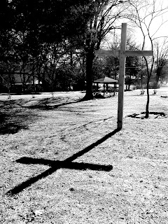
In this photo I wanted my cross to stand out against
the background so I used lasso tool to turn the brightness up
just on the cross, and since I lost some of the details I used my
dodge tool to darken those places again.
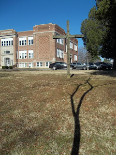
This is the same brightness vs. contrast as before, only this
time I played with my color levels to create a sepia composition.
This one is probably my favorite because I feel like I got the
levels of brightness vs. darkness pretty close to perfect. I was able
to get a really great contrast, as well as getting the cross to stand out
from the background, without loosing too much detail.
Friday, January 25, 2013
Black & White
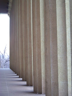
These are my four strongest black and white photos.
I think this one is probably the strongest out of the four.
Wednesday, January 23, 2013
Ansel Adams
Created the averaging of middle grey, which led to the auto settings on the camera. Averaging the middle grey a little to the left (pure black) or right (pure white) on the grey scale will give you a less flat photograph, rather than completely flat with middle grey.
Ansel Easton Adams (February 20, 1902 – April 22, 1984) was an American photographer and environmentalist best known for his black-and-white landscape photographs of the American West, especially Yosemite National Park.[1]
With Fred Archer, Adams developed the Zone System as a way to determine proper exposure and adjust the contrast of the final print. The resulting clarity and depth characterized his photographs and the work of those to whom he taught the system. Adams primarily used large-format cameras despite their size, weight, setup time, and film cost, because their high resolution helped ensure sharpness in his images.
Photos for Assignment 1
I picked the images below because they all match the criteria of a "good" black and white photo: directional lighting, nice dark areas, nice bright areas, and strong dynamic contrast. I also picked the images below because of how compositionally interesting they are.
This one is my favorite because of how the directional contrast makes such a great contrast between the dark and bright areas.
This one is the weakest to me because it doesn't have dark enough dark areas.
Subscribe to:
Comments (Atom)


