Assignment one was easy and tricky at the same time.
It was easy because for the most part all we were doing was desaturating our
photos, yet it got a bit tricky whenever I began changing the contrast.
I couldn't decide what the best brightness vs. darkness was
because I was scared I was loosing too much detail. I also had some trouble
dodging and burning because it kept looking a little too unnatural for me.
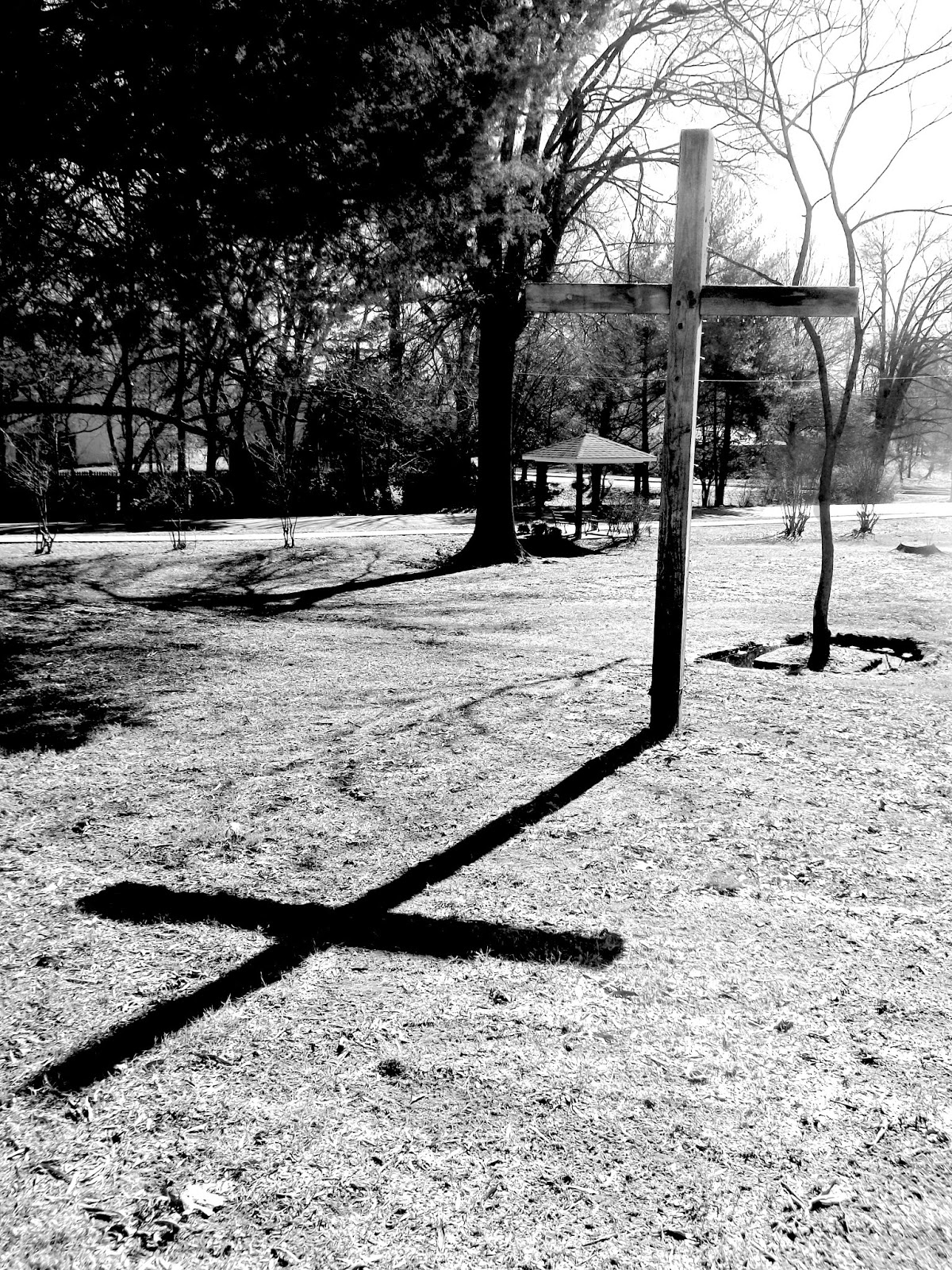
In this photo I wanted my cross to stand out against
the background so I used lasso tool to turn the brightness up
just on the cross, and since I lost some of the details I used my
dodge tool to darken those places again.

This is the same brightness vs. contrast as before, only this
time I played with my color levels to create a sepia composition.


This one is probably my favorite because I feel like I got the
levels of brightness vs. darkness pretty close to perfect. I was able
to get a really great contrast, as well as getting the cross to stand out
from the background, without loosing too much detail.
No comments:
Post a Comment